Visualize
Halie
6/29/2021
3. Visualize
3.1 Read in data
# libraries
library(here)
## here() starts at C:/Users/halie.ofarrell/OneDrive - Florida Fish and Wildlife Conservation/Stock Assessments/Software/R/r3-exerciseslibrary(readr)
library(DT)
# variables
url_ac <- "https://oceanview.pfeg.noaa.gov/erddap/tabledap/cciea_AC.csv"
csv_ac <- here("data/cciea_AC.csv")
# read data
d_ac <- read_csv(url_ac, col_names = F, skip = 2)##
## -- Column specification --------------------------------------------------------
## cols(
## .default = col_double(),
## X1 = col_datetime(format = "")
## )
## i Use `spec()` for the full column specifications.names(d_ac) <- names(read_csv(url_ac))##
## -- Column specification --------------------------------------------------------
## cols(
## .default = col_character()
## )
## i Use `spec()` for the full column specifications.# show data
datatable(d_ac)3.2 Plot statistically with ggplot2
3.2.1 Simple line plot + geom_line()
library(dplyr)##
## Attaching package: 'dplyr'## The following objects are masked from 'package:stats':
##
## filter, lag## The following objects are masked from 'package:base':
##
## intersect, setdiff, setequal, unionlibrary(ggplot2)
# subset data
d_coast <- d_ac %>%
# select columns
select(time, total_fisheries_revenue_coastwide) %>%
# filter rows
filter(!is.na(total_fisheries_revenue_coastwide))
datatable(d_coast)# ggplot object
p_coast <- d_coast %>%
# setup aesthetics
ggplot(aes(x = time, y = total_fisheries_revenue_coastwide)) +
# add geometry
geom_line()
# show plot
p_coast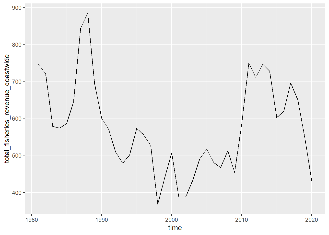
3.2.2 Trend line + geom_smooth()
Add a smooth layer based on linear model
p_coast + geom_smooth(method = "gam")## `geom_smooth()` using formula 'y ~ s(x, bs = "cs")'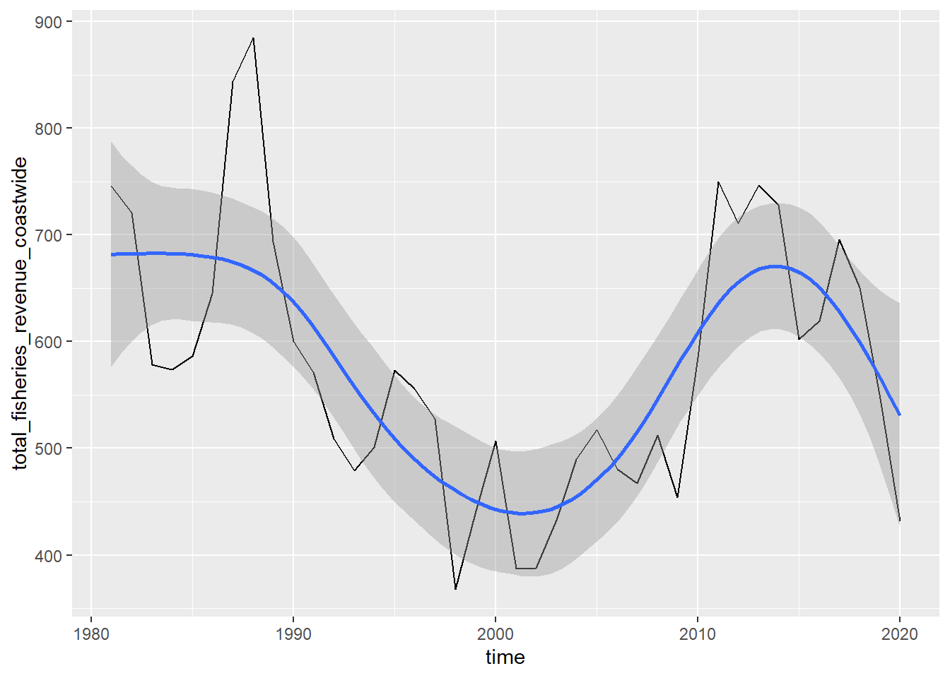
3.2.3 Distribution of values + geom_histogram()
d_coast %>%
  # setup aesthetics
  ggplot(aes(x = total_fisheries_revenue_coastwide)) +
  # add geometry
  geom_histogram()
## `stat_bin()` using `bins = 30`. Pick better value with `binwidth`.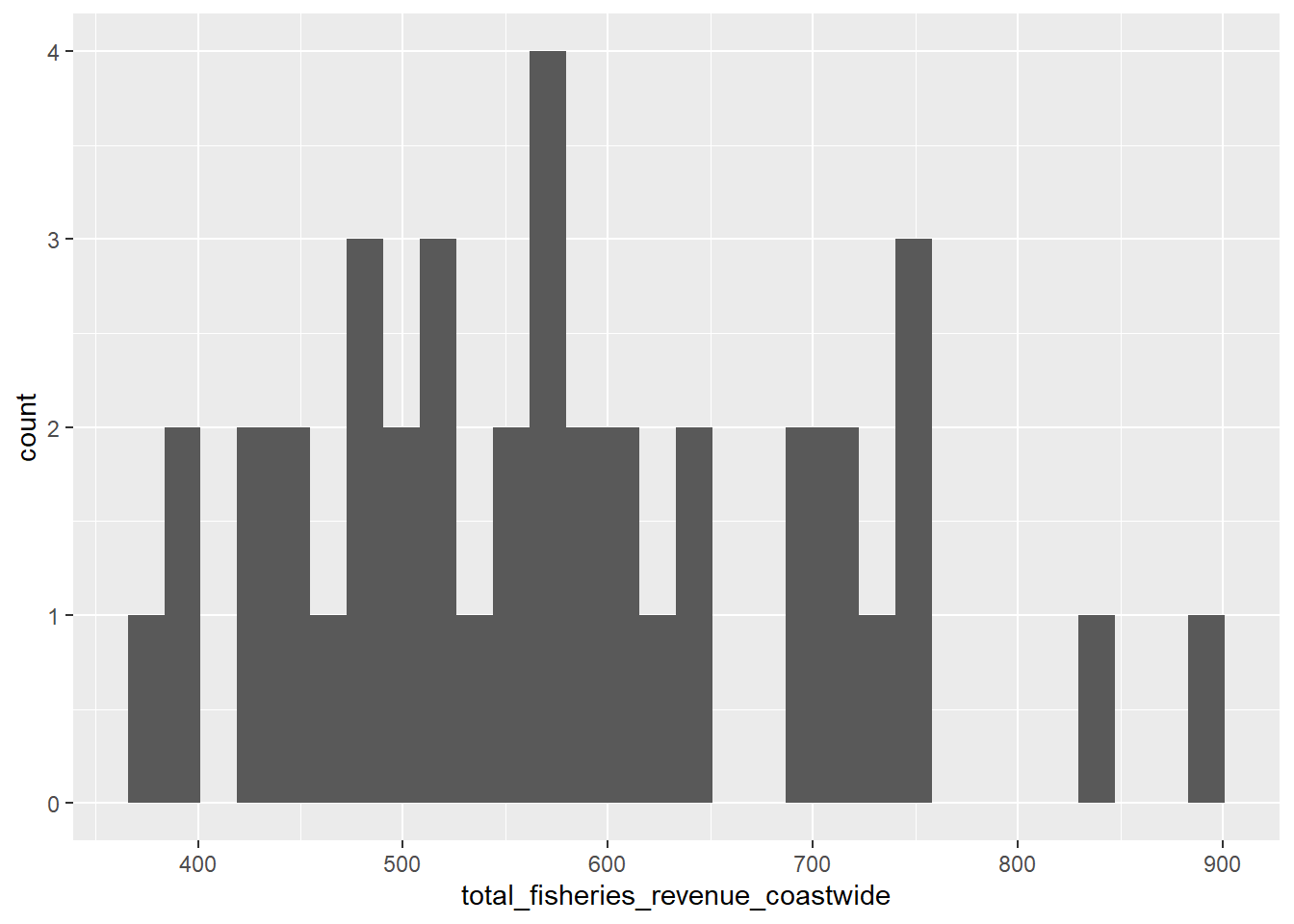
3.2.4 Series line plot aes(color = region)
library(stringr)
library(tidyr)

d_rgn <- d_ac %>%
  # select columns
  select(time, starts_with("total_fisheries_revenue")) %>%
  # exclude column
  select(-total_fisheries_revenue_coastwide) %>%
  # pivot longer all columns but time
  pivot_longer(-time) %>%
  #mutate region by stripping "other"
  mutate(region = name %>%
           str_replace("total_fisheries_revenue_", "") %>%
           str_to_upper()) %>%
  # filter for not NA
  filter(!is.na(value)) %>%
  # select columns
  select(time, region, value)

# create plot object
p_rgn <- ggplot(d_rgn,
                # aesthetics
                aes(x = time, y = value, group = region, color = region)) +
  # geometry
  geom_line()

# show plot
p_rgn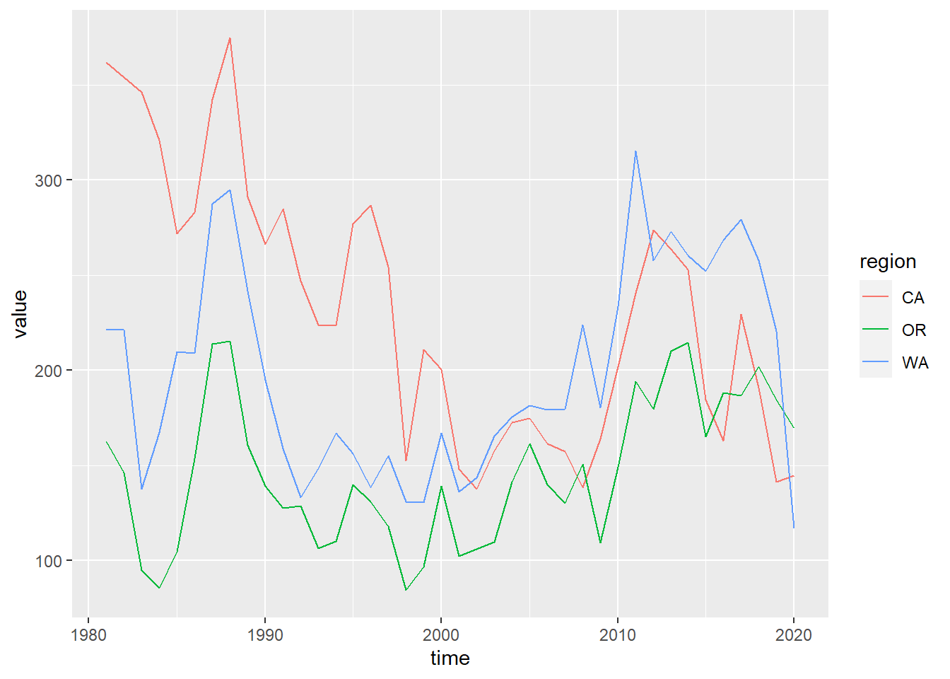
3.2.5 Update labels + labs()
p_rgn <- p_rgn +
  labs(title = "Fisheries Revenue", x = "Year", y = "Millions $ (year 2015)", color = "Region")
p_rgn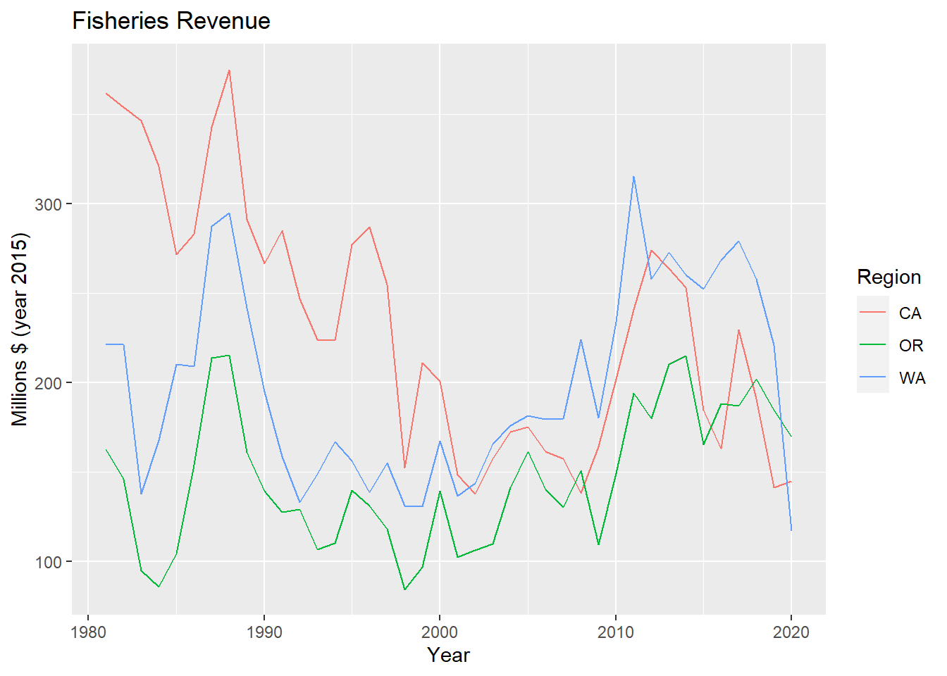
3.2.6 Multiple plots with facet_wrap()
p_rgn + facet_wrap(vars(region))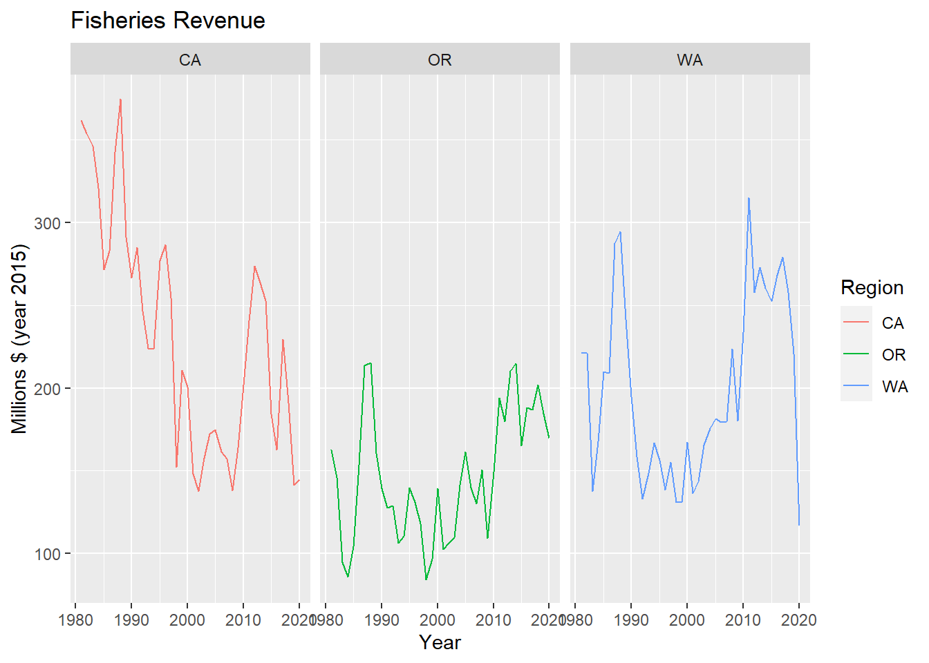
3.2.7 Bar plot + geom_col()
library(glue)##
## Attaching package: 'glue'## The following object is masked from 'package:dplyr':
##
## collapselibrary(lubridate)##
## Attaching package: 'lubridate'## The following objects are masked from 'package:base':
##
## date, intersect, setdiff, union# Determine terminal year
yr_max <- year(max(d_rgn$time))
d_rgn %>%
# filter by most recent time
filter(year(time) == yr_max) %>%
# set up aesthetics
ggplot(aes(x = region, y = value, fill = region)) +
# add geometry
geom_col() +
# add labels
labs(title = glue("Fisheries Revenue for {yr_max}"), x = "Region", y = "Millions $ (year 2015)", fill = "Region")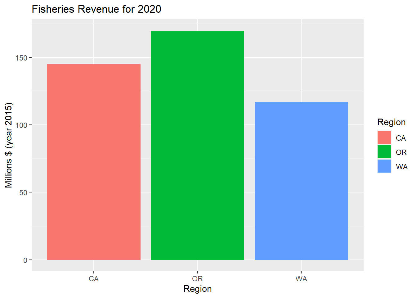
3.2.8 Variation of series with + geom_boxplot()
d_rgn %>%
  # set up aesthetics
  ggplot(aes(x = region, y = value, fill = region)) +
  # add geometry
  geom_boxplot() +
  # add labels
  labs(title = "Fisheries Revenue Variability", x = "Region", y = "Millions $ (year 2015)") +
  # drop legend because it is redundant with x axis
  theme(legend.position = "none")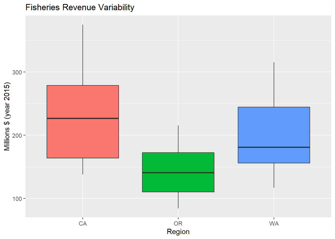
3.2.9 Variation of series with + geom_violin()
p_rgn_violin <- d_rgn %>%
  # set up aesthetics
  ggplot(aes(x = region, y = value, fill = region)) +
  # add geometry
  geom_violin() +
  # add labels
  labs(title = "Fisheries Revenue Variability", x = "Region", y = "Millions $ (year 2015)") +
  # drop legend because it is redundant with x axis
  theme(legend.position = "none")
p_rgn_violin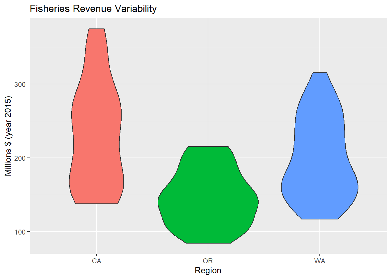
3.2.10 Change Theme theme()
p_rgn_violin + theme_classic()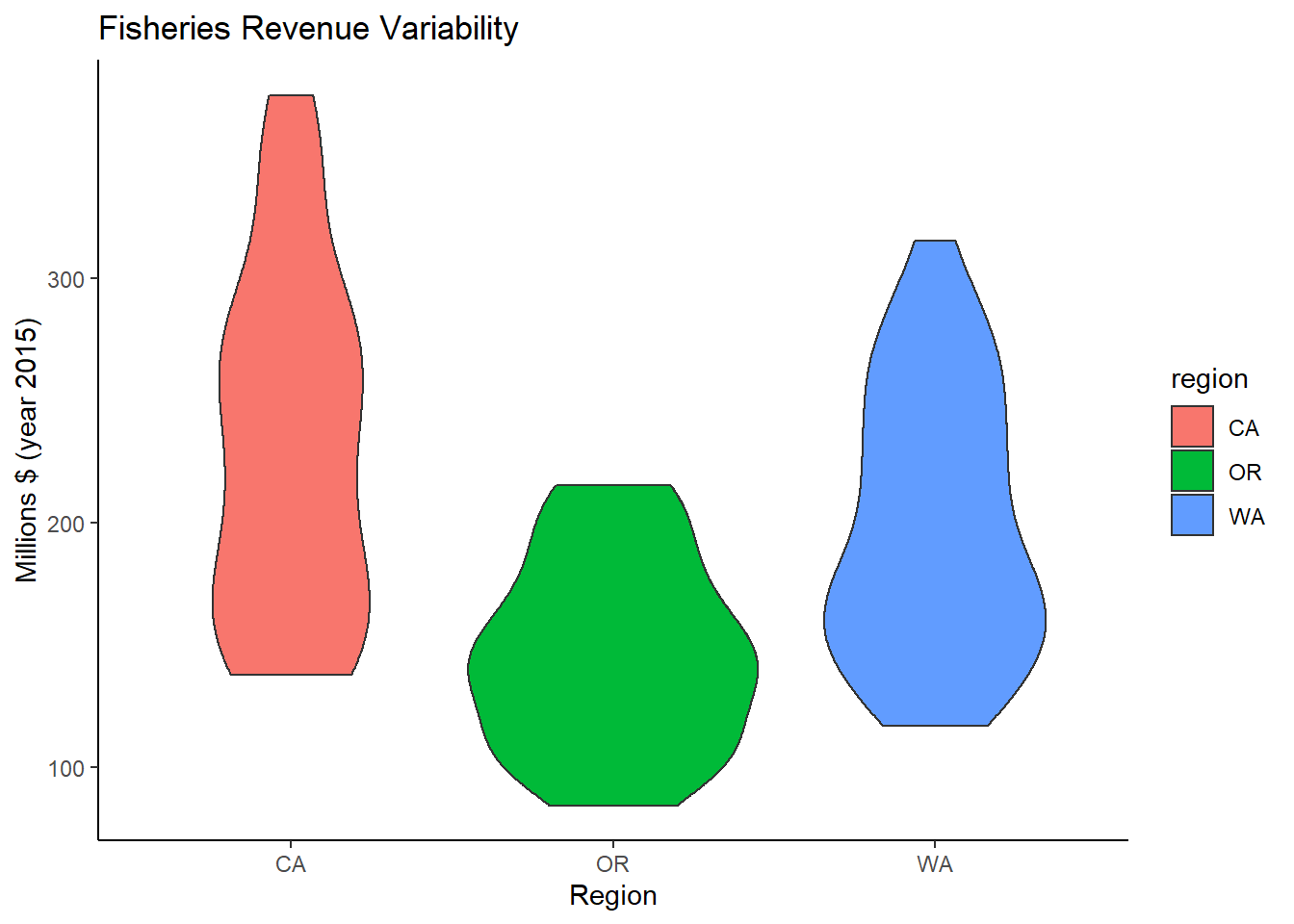
3.3 Plot interactively with plotly or dygraphs
3.3.1 Make ggplot interactive with plotly::ggplotly
library(plotly)##
## Attaching package: 'plotly'## The following object is masked from 'package:ggplot2':
##
## last_plot## The following object is masked from 'package:stats':
##
## filter## The following object is masked from 'package:graphics':
##
## layoutggplotly(p_rgn)3.3.2 Create interactive time series with dygraphs::dygraph
library(dygraphs)

#packages requires wide format
d_rgn_wide <- d_rgn %>%
  mutate(Year = year(time)) %>%
  select(Year, region, value) %>%
  pivot_wider(names_from = region, values_from = value)
datatable(d_rgn_wide)
d_rgn_wide %>%
dygraph() %>%
dyRangeSelector()